For the Stats Interactives project, I was given a challenge that initially I wasn’t sure how to solve.
First, some background: Stats Interactives is a set of four simulations used in Quantitative Analysis I at the School for International and Public Affairs. The course teaches statistics to future policy makers, so that they’ll have the skills to understand research that they will encounter in their careers.
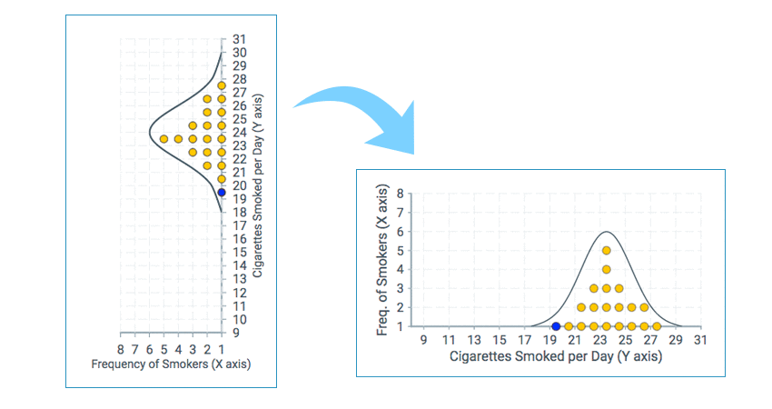
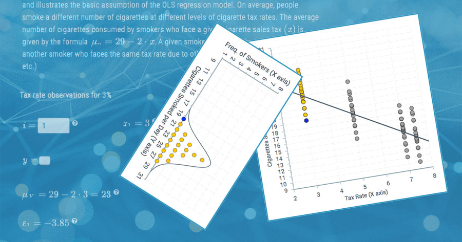
For one interactive, our faculty partner Dr. Doru Cojoc invented a particularly insightful method for teaching students linear regression. He found that his students would struggle to understand the distribution of values around the predicted mean in the classic X-Y representation of graphs. By rotating the graphs, such that the Y axes would align vertically, such that students could more easily see the relationship. In class, he would demonstrate this relationship statically—first showing students the graphs with the Y axes aligned, and then showing them in the classical view with the X axes aligned.
The challenge given to our team was to reinforce the juxtaposition in the online environment. Initially we thought we would show one, than the other—just as Dr. Cojoc would in class—one slide, than another. Dr. Cojoc wanted more though. He imagined these as an animation, first showing the graphs vertically, then rotating them horizontally.

As the developer on the project, I wasn’t sure that there was a way to do what he imagined. Thinking purely in terms of animation, I was thinking that I’d need to paint all the page content onto a canvas element, so that they could be animated. On its face though, this wasn’t feasible. It would make the content inaccessible, and there wasn’t time to add such a layer of complexity to the app. I knew that the CSS spec included animations and transitions, but I thought these would not apply because the graphs in the app were rendered as SVGs. Once I took a closer look at the CSS docs, I realized that I could make use of these parts of the CSS API, and achieve what Dr. Cojoc had in mind.
The implementation that followed is composed of three parts. It uses
react-transition-group
to manage the transitions, component state in React to trigger the transition,
and CSS transitions to push the pixels around.
In short, react-transition-group essentially adds and removes class names to
and from components according to a defined schedule. The Transition component
takes the duration of the transition as a number of milliseconds. When the
component is rendered, it adds class names to indicate that it is under
transition, and then removes them when complete.
React component state was used to trigger the transition. In this case a simple Boolean was toggled by a button on the page. To make it easier to manage, I wrapped each layout in its own component, and then conditionally rendered the components based on the Boolean in the component state. The crux of it looks like this:
<TransitionGroup>
    {this.state.flipGraphs === false ? (
        <CSSTransition
            key={this.state.flipGraphs}
            onExited={this.handleFreeToggleLock}
            classNames="graph-transition"
            timeout={3000}>
            <StateAContainer
                taxRateIdx={this.state.taxRateIdx}
                handleTaxRateIdx={this.handleTaxRateIdx}
                y_i={this.state.y_i}
                mean={this.state.mean}
                epsilon={this.state.epsilon}
                activeDataIdx={this.state.activeDataIdx}
            />
        </CSSTransition>
    ) : (
        <CSSTransition
            key={this.state.flipGraphs}
            onExited={this.handleFreeToggleLock}
            classNames="graph-transition"
            timeout={3000}>
            <StateBContainer
                taxRateIdx={this.state.taxRateIdx}
                handleTaxRateIdx={this.handleTaxRateIdx}
                y_i={this.state.y_i}
                mean={this.state.mean}
                epsilon={this.state.epsilon}
                activeDataIdx={this.state.activeDataIdx}
            />
        </CSSTransition>
    )}
</TransitionGroup>
Once I could successfully render the two layouts, I set about to animate the transition from one to the other. First, I needed to position both layouts during the transition so that both would occupy the same position on the page. The initial layout would have the css transition applied to it while the subsequent layout was laying in wait, its opacity set to 0. Once the parts of the first layout were moved into position they would fade out, and the new layout would fade in.
Within a single transition, there are a few things that need to happen.
Perhaps one element needs to rotate, perhaps another needs to rotate and
reflect. The CSS transition syntax makes this easy to handle with transform
and transition keywords. I thought of transform as the “what”—what
should this element do; and transition as the “how”—specifically which
transform’s should happen when. It’s also worth mentioning how using nested
selectors in SCSS made writing these transitions a bit easier. The entire
code is too long to quote here, but it can be found in the project’s
GitHub repo.
The implementation of this animation and transition code can be seen on
the linear regression model page.
Some caveats about this approach. First I needed to address race conditions that might occur if someone clicked the toggle button while the animation was running. The way to fix this was to set a “lock” on the button while the animation was running, and use a callback passed to the transition component to free the lock once the animation was complete. Secondly, this particular implementation has some limitations in terms of responsive design. I needed to hard code in widths and heights for each layout to ensure that corresponding elements were aligned at the end of a transition. This could be addressed by programatically checking the dimensions of the elements. In this case, because the particular learning objectives are bound to the layout of the graphs, creating a responsive didn’t really make sense.
The Stats Interactive site is open to public, and the source code is on GitHub repository.
Printed from: https://compiled.ctl.columbia.edu/articles/stats-css-transitions/

