When I first came to the CTL, I remember thinking “accessibility” meant ramps and elevators. Now, after almost two years of research, discussions, and experimentation, I realize it’s really all about access. In this post, I’ve outlined three digital accessibility strategies that can be applied to educational video projects:
Strategy 1: Write with accessibility in mind.
Strategy 2: Schedule time to test the digital accessibility of your
project.
Strategy 3: Find new barriers to knock down.
Strategy 1: Write with accessibility in mind
While much of the following article specifically pertains to digital accessibility in video, Strategy 1, “Write with accessibility in mind”, focuses heavily on written communication, which is something that most folks can always strive to improve.
When drafting a video script, whether it be a lecture, an interview, a conversation, or even an artifact examination, the “Narration”, often referred to as “Voice Over” or “VO”, should be clear, concise, and not contain any barriers to inclusion. It should be written so that whether the script is read silently, read aloud, or viewed as a video, the learner should walk away with a solid understanding of the material presented.
The following are a few specific examples of how you can write your videos with accessibility in mind.
Example 1: When writing, you want to ensure that your script will be understood. For example, use caution when using idiomatic expressions that assume familiarity. An idiom such as “from soup to nuts” would be better written as “all encompassing” or “from start to finish”.
Example 2: It’s important to learners that they encounter diverse sources of information. Whenever possible, try to include expertise in your script from all sorts of people, professionals, and places.
Pro tip: Script writing is an intense undertaking. It’s important that you set clear expectations of how much time should be spent on writing content, and set milestones for scaffolding exercises and multiple drafts. It’s very helpful to set up a weekly or bi-weekly meeting to check in, give notes, and work together on improving the script until it’s locked. This point actually segues nicely into our next strategy.
Strategy 2: Schedule time to test the digital accessibility of your project
Whether you’re working by yourself or with a team, it’s important to schedule time to envision your project and look for any gaps in accessibility.
Now comes the time for us to get a bit more technical. Some questions to consider from a digital accessibility standpoint are the following.
Which video player will be used for your video?
Options for the CTL include YouTube, Panopto, and LMS players provided by EdX, Coursera, and CourseWorks. At the CTL, we usually upload directly to YouTube and then embed our videos into platforms like CourseWorks and EdX. When you embed the YouTube player, you can retain accessible video play features like closed captions and playback speed. Captions and playback speed are great tools for people with learning disabilities, non-native English speakers, or people watching in public places.
Are you using a professional Captioning Service?
Because the CTL puts out so many videos of varying length, we use Rev to professionally caption our videos. This is a great alternative compared to making the edits all on your own. There are many professional captioning services out there, so research and select the one that best fits your needs.
Plan extra time for yourself or another member of your team to review your captions. When doing a MOOC, it can take over an hour per section to do a QA review of the captions provided by Rev. Despite Rev being a professional service, they can make mistakes and it’s up to you to catch them.
What is your method for editing captions? Have you set aside extra time to edit them?
YouTube has the capability to edit the captions directly and download both
.srt and .vtt files, which are standard timed caption formats.
At the CTL, we’ve switched over to using Rev’s internal editor and website as our organizational hub. The reason we’ve done this is that Rev has added a feature where you can link your captions directly to your YouTube videos when you order them.
You can then use the Rev Caption Editor to correct the captions, add speaker names, and add titles. The changes will automatically update on YouTube. This feature has saved the CTL Media Team a ton of time.
What types of edits should I be making to my captions?
In addition to fixing typos and common misspellings, it’s important to add speaker names, especially if there is more than one person talking. At the CTL, we simply put the last name of the speaker with no additional suffix (such as MBA, PhD, etc).
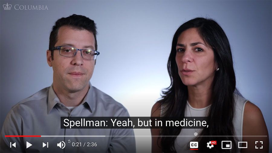
Add speakers’ names. Here, we have an example of Dr. Jessica Spellman and Dr. David Kessler having a conversation. We consistently used just the last names whenever one of them would start a new thought.
You should also manually add a video title to your captions. The video title is
then included in the downloadable transcript (.txt file). The title will help
the learner with their course navigation, especially if you’re launching a MOOC
with many videos.
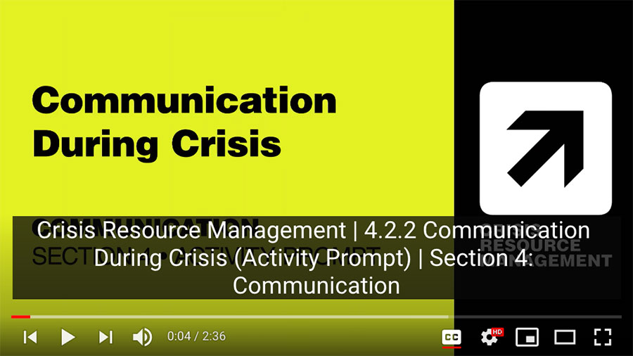
We added a captions title, even though there is a visual title on screen. This title is added to proactively help you create your downloadable transcripts.
Another way to create a title without having to add it manually via .srt or
.vtt is to have a VO recording of your titles. We did this in the
Inclusive Teaching MOOC,
as well as From Books to Bytes.
However, we were unable to record the numbering system in these instances,
which could also be a useful reference. There are pros and cons to both
methods, so choose what works best for your context.
My recommendation for the most accessible option would be to do both the VO
narration as well as an edited .srt file with any additional relevant
information, such as numbering.
Is your video design accessible?
This question ties back to Strategies 1 and 2, so don’t leave this ‘til the end! It’s important that you continually incorporate accessibility thinking into your graphic design process.
Design the visuals in your video to make room for closed captions
Take the two images below as contrasting examples. In the first image, there is a lot of information on screen and the last bullet point is covered by the captions.
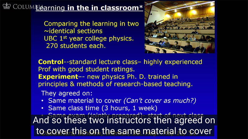
Example 1: Note how information is covered by the captions. There is also a lot of text on screen, which could be pared down.
Typically, captions obscure the bottom 1/5th of the player window, as shown in the first example. Aim to keep any relevant text or imagery out of the bottom 1/5th of the player window, as shown in the second example.
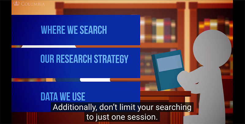
Example 2: Note the purposeful placement of information on screen. Make sure that no text or relevant visuals are being covered by the captions.
Include diverse and inclusive imagery
Showcasing a diversity of experts in a field of study ensures all people are represented. Showcasing diversity in your educational content also encourages all learners to examine their own stereotypes and biases. It’s dual purpose.
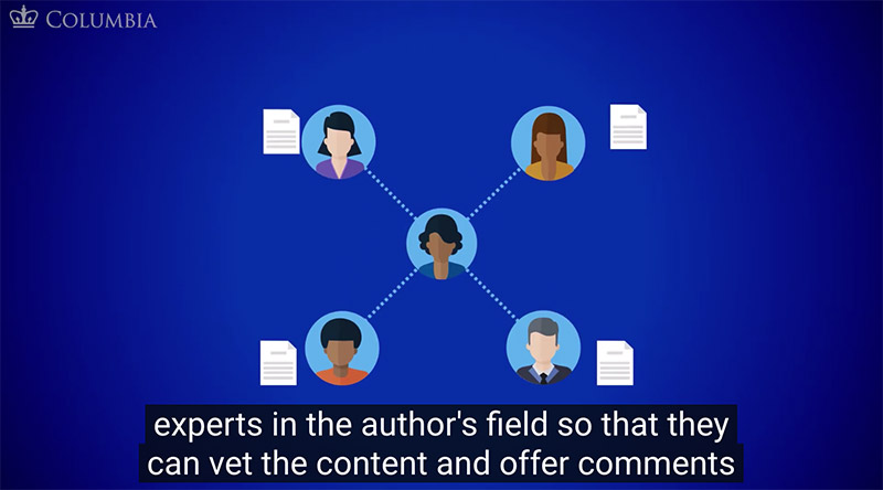
Intentional Design: We purposefully showcased a diverse group of experts in our video designs.
Exclude unnecessary imagery
Don’t include imagery that distracts from the message. It’s the same idea as writing with accessibility in mind. In our 2020 RFP, From Books to Bytes, we designed the students to be androgynous and featureless. This was done so that learners watching would not compare themselves to the student on the screen, which can distract from the main message of the video.
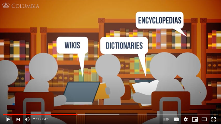
The visual image of students in this scene are designed to minimize distractions from the video content.
What kind of transcript are you providing and where is it being provided?
Downloadable transcripts should come at the top of the page when possible, so that a person using a screen reader knows it’s there sooner. We were able to do this within Coursera by using their Download feature for Handouts and then simply hyperlinking the transcripts we created at the top of each video page. When using EdX, there is a special location where the transcript is downloadable underneath every video.
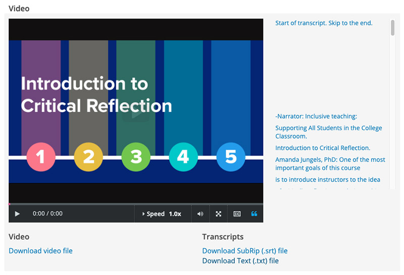
Some LMS Players have designated spots for transcripts.
Having a downloadable .txt file is acceptable, however, transcripts can
include much more information, including timestamps and a visually pleasing
formatting. Ideally, you want it to be an enjoyable reading experience for a
visual learner as well. Therefore, you might want to consider formatting the
document in Word and then exporting as an accessible PDF, which I provide more
information on at the end of this article.
After you’ve reflected and tested these considerations, use the extra time you’ve given yourself to help with the third and final strategy.
Strategy 3: Find new barriers to knock down
By using Strategy 2 and scheduling more time for accessibility considerations, you may find an aspect of your video’s accessibility that can be improved that you had never thought of before.
For example, at the CTL, when it came to third-party media attributions (such as archival photos and videos), we didn’t have a consistent way of giving the images proper credit. Also, the learner didn’t have an easy way of finding the images themselves if they had interest in researching it further.
So, even though a visual learner technically can access the image by looking at it when it appears on screen, it still isn’t very “accessible” to them. Thus, we created a new way of providing credits.
For our latest 2020 MOOC, Indigenous Peoples’ Rights, we created an accessible bibliography that can be accessed via a bitly link that appears on screen: bit.ly/ipr-credits.
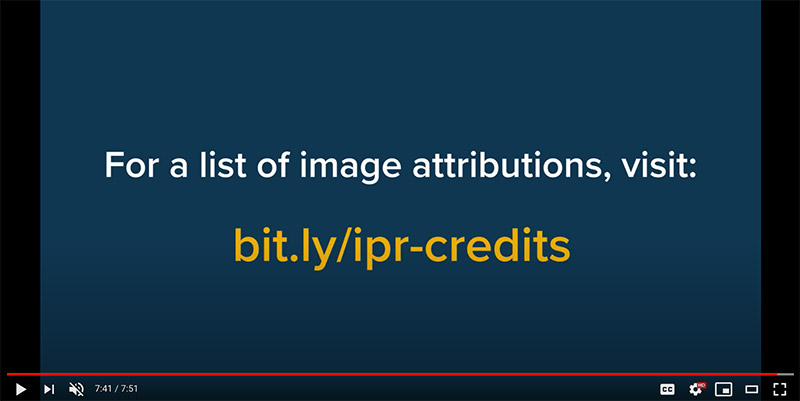
The bibliography is also available as a downloadable resource within the EdX LMS system. The bibliography is 29 pages long and includes hundreds of third-party image credits in order of appearance, includes proper MLA/APA inspired citations, provides a link to the original web image source, and is a text searchable document.
I used MS-Word and Adobe Acrobat to create the accessible bibliography. Please see the resource links at the end of this post for more information.
In the future, an additional step to make the image credit bibliography even more accessible would be to include the bit.ly link within the descriptions of the YouTube playlists as well as in each YouTube video. However, at the time of uploading this MOOC, we had not made such a consideration. It’s something that can be revisited, which is exactly what accessibility design is all about: learn, implement, repeat.
Conclusion
I hope that this brief introduction to video accessibility has provided you with some useful strategies and examples that you can draw upon when doing your own work. Sometimes the accessibility considerations add up and they can cause frustration or the feeling of “is this really worth it?” However, the most important advice I can give when hitting a wall is two-fold: (1) simple fixes have a big impact and (2) we don’t often see the impact of our life’s work on others, but that doesn’t mean it shouldn’t be done properly.
Make it accessible, because it’s what’s best for everyone, yourself included.
Resources List
Printed from: https://compiled.ctl.columbia.edu/articles/strategies-digital-accessibility/

