This post is based on my lightning talk at Women Who Code–NYC end-of-year meetup on December 12, 2018.
In Fall 2018, my colleague Susan Dreher and I worked on the platform migration of a set of web-based learning modules developed in partnership with Columbia’s Mailman School of Public Health. These modules are offered by the Region 2 Public Health Training Center to the public as continuing education for learners in the public health workforce.
The Public Health Training Center (PHTC) modules were implemented in 2011 in the CTL’s content management tool Pagetree. The Pagetree architecture is based on Django, a high-level Python Web framework, backed by a Postgres data store. The design of the sites was not responsive, and was marginally optimized for accessibility.
We converted the modules into static pages using Hugo, an open-source static site generator that renders HTML files as output from content files and layout templates. The goal was not to redesign or re-envision the original pedagogical objectives of these learning modules, but rather to move them into an open ecosystem and make some amendments when necessary. These modules will continue to be offered as free and open educational resources through the TrainingFinder Real-time Affiliate Integrated Network (TRAIN) platform.
We saw this migration as an opportunity to redesign and rewrite the codebase to meet the Web Content Accessibility Guidelines (WCAG). We also wanted the modules to be compatible with all devices, including print, especially because they are open to public.
I quickly learned that we couldn’t simply migrate the content over for responsive web design and accessibility. The content itself (text, images, table, quizzes, and interactives) needed to be reworked. We needed to make sure user experience on each device (computer, tablet, smartphone, assistive technologies, and print) is comparable without compromising the quality of the content.
In this post, I’d like to share with you the process that I went through with one particular piece of content—an imagemap—in one of the module.
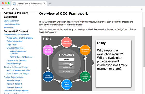
Image map in the old PHTC module
This is an imagemap of an infographic explaining the CDC framework (see it in action). This interactive was designed to break the text-heavy sections of a module. As the cursor hovers on a hotspot, the associated explanation is revealed on the right. This interaction is not suitable for touchscreen devices.
The whole interactive was basically image-swapping driven by JavaScript. It was neither responsive, nor accessible, nor printable. We needed to fix this.
To optimize this interactive infographic for responsive design and accessibility, I took the following steps:
- Be aware of the intended meaning, and how learners learn from this diagram,
- Unpack and unlearn the assumptions and biases of that design,
- With the content expert, explore how the information could be repackaged and delivered differently, and what flexibility could be afforded here,
- Look at the available framework to form a solution,
- Repackage the reorganized content,
- Test the technology, and validate the cognitive process.
1. Be aware of the meaning and learning process: Metacognition
To understand what this infographic was for, I needed to figure out what the intended meaning was, and how learners were expected to learn from this diagram. What were the assumptions about the visual shapes serving as cues for this diagram? Why was it designed this way?
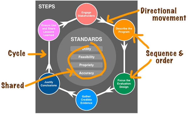
The arrows in the diagram show directional movement. The positions of the hotspots signify sequence and order, the hexagonal connectors construct a cycle, and encompass the shared standards in the middle of the diagram. These representations are assumed common, based on past uses everywhere for many, many diagrams.
2. Unpack and unlearn
Could the same meaning be presented if the learner didn’t have access to the visual cues? How could I unpack them?
I knew the following about the diagram:
- The association between one hotspot and the text was one-to-one,
- The hotspots represented steps, the first being the top item, the sequence was clockwise,
- User could hover the hotspots in order. Or not. There were no “gated” restrictions in place.
3. Repackage content
Imagine these hotspots as beads on a bracelet and string. If I cut that bracelet and rearrange the hotspots linearly, and place the information text box below the linear hotspots, the “beads” become headings of tabs. When user clicks a tab, the associated explanation is revealed in the text box.
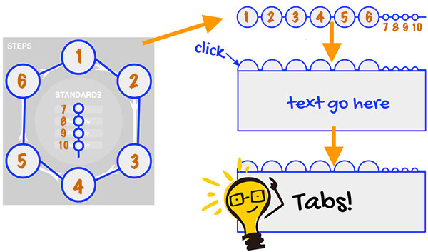
This was an appealing design for the following reasons:
- Clicking the tabs instead of hovering is suited for touchscreen devices,
- Users can navigate the content with their keyboard,
- The tabs are in order (left to right),
- This content can be rearranged, or restacked for small screen sizes,
- There are examples of codes available already for accessible tab content, and screen readers can “read” it.
Next, I needed to run this new design with the content expert to confirm that the intended meaning was held up in this arrangement.
4. Look at frameworks for solutions
There are many ways to make the new design happen, however, time given was finite. I chose Bootstrap tab nav as a solution because it already has the CSS, JavaScript, and accessibility solutions in place. I wrote a custom CSS to preserve the visual design of the infographics. I relied heavily on Axe, an open source rules extension for accessibility to help me debug my code.
5. Repackage the reorganized content
This is the redesign of the infographic, and it looks just like the old one, but with marked improvements:
- It can be read by screen readers,
- The hotspots and associated explanation are now text,
- Users can navigate through the interactive using the tab key, in proper order,
- The infographic is now responsive, the layout changes accordingly on smaller screens,
- It is printable.
6. Test and validate
I ran this page, and the old version for comparison, against Google’s Lighthouse, an open-source tool for performance and accessibility. The accessibility score for the new version increased from 75% to 93%. It is a little shy of the perfect score because the color contrast of the diagram didn’t quite meet the WCAG guidelines. This is still a work in progress.
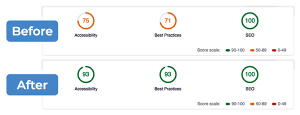
Lighthouse and Axe are accessibility tests for codes and technology. But did the new arrangement of content make sense cognitively in assistive devices and on smartphones?
With the content expert, we looked at the redesigned infographic on smartphones, tablets, and desktop computers to make sure that the content was delivered as intended by the pedagogy. We ran the page through Apple’s screen reader, VoiceOver, to hear if the “reading” was comparable.
We confirmed that the intended meaning of the infographic was preserved on all devices in the new version.
Lesson learned
I went through the same process here for other content types in all the modules—tables, images, charts, and quizzes. The big lesson that I learned from the PHTC migration project is: Application design for accessibility and inclusion is not simply a technical implementation appended to a development process.
In fact, technology is only one piece that made the whole. The other influencing pieces are pedagogy, the cognitive process, the user-end choices and control, and the awareness of the comparable experiences of differing abilities.
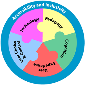
The awareness of the learning process informs us how we should code to ensure that the intended pedagogy can be processed by everyone, with differing abilities and and comparable experiences, through all devices.
Printed from: https://compiled.ctl.columbia.edu/articles/a11y-rwd-imagemap/

