I would like to emphasize the value of accessibility-driven development, from the perspective of a new developer. I joined the Center for Teaching and Learning at Columbia University in June of 2022 – about half a year ago, as I write this article. At the time there was a big push to improve the digital accessibility of our applications. Training modules were passed around and everyone on the dev team was refining their language, learning to describe and develop software for the widest possible audience. Being new to the team, this gave me an opportunity to specialize in something that the others were not entirely ahead on, and accessibility compliance reviews gave me a point of entry to study the standards and structure of our internal development. The standards of W3C and other development guides provided a solid foundation to start from, when creative solutions were required.
A few months later, in October 2022, the university put out an official statement on the matter which set the expectations for all future projects. As I began to sit in on meetings for the new development cycle, accessibility helped us to express more thorough use cases, defining the underlying structure of the projects. How does a user navigate the site if they can’t see the screen? How much can we strip away and simplify while preserving core functionality? And what styling can be applied to give the project a personality without disrupting the user experience?
That said, there is not always a clear path. As I write this I am working on a project based around modeling 3D objects for calculus. The objects can be time-dependent and animated, users can observe the normal vector and the tangent plane at any point on an object, and presenters can poll the viewers with different kinds of questions.

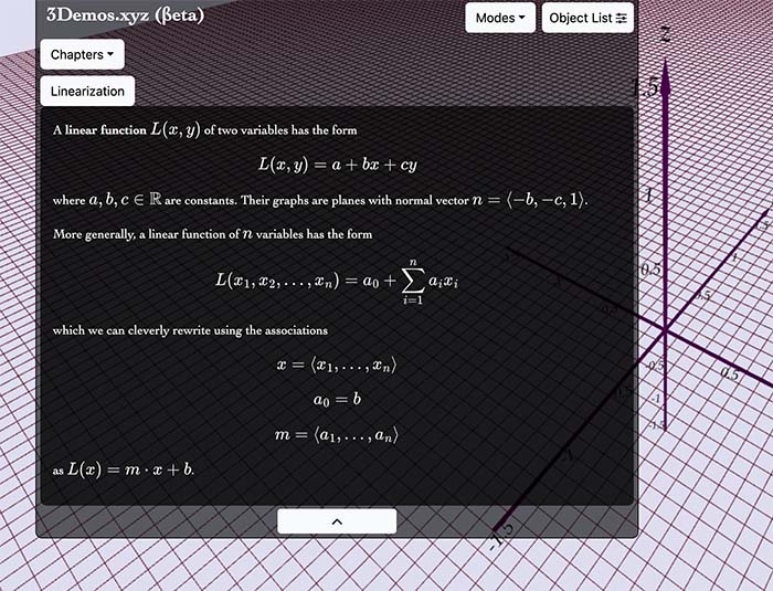
An integration of MathJax typesetting into an instructional module.

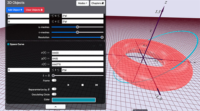
A detailed display of object parameters that define the red torus.
A useful visual aid to be sure, but how do you translate that information to users who experience the platform without the visuals? Others might not have access to a computer at all, so we need to consider where we can fit navigation buttons on a tablet screen. Some might have limited motor functions which makes mouse controls difficult. Among the multivariable abilities of users it can feel overwhelming to consider the intersectionality of these experiences. How many permutations can you reasonably account for in a single development cycle, and who do you prioritize? Fortunately, solutions are rarely so narrow, and the answer to one problem can often fix several others. That’s where creativity lives.
Math typesetting is one area that presents distinct issues. Compliance is not actually universal across platforms and what works on Mozilla Firefox might not work in Chromium-based browsers. Our original build ran on a library called katex which used MathML to format and read Tex and LaTex inputs. This worked well for Firefox, but Google Chrome and other Chromium-based browsers do not interpret MathML, and any screen reader that saw 3 × √4 ≤ 6ya would interpret it as “3 \times \sqrt 4 \leq 6 y_a”. Suddenly the student is required to know LaTex formatting and parse the equation from a verbal description. While this is accurate LaTex formatting, it creates an additional barrier for understanding. In this case we switched over to the more robust MathJax library, which is compatible with all browsers. As much as it can be exciting to explore newer libraries, unless APIs are developed with accessibility in mind, the newest thing on the market often only appeals to developers with the luxury to disregard the needs of some users.
Even so, the usefulness of this application remains limited to people with at least some degree of sight. To describe every facet of a graphical representation of these formulae would take longer than to express the underlying theory of the math which it represents. In that sense we don’t strive to be perfect, but we work hard to improve the experience for everyone, and in doing so we improve as developers.
Printed from: https://compiled.ctl.columbia.edu/articles/accessibility-development-framework/

