Digital accessibility means that content on websites and digital platforms is developed so that everyone, including people with disabilities, can perceive, interact, understand, and navigate using a wide range of devices and assistive technologies. This applies to content in PDF documents, considering that this file format is one of the most widely used digital formats in the world.
PDF is a popular format because it presents an electronic version of a printed document. It affords robust and reliable options for presentation, layout, and interactivity, that is independent of hardware and operating system. It is also tricky for accessibility, because of the flexibility of layout it provides.
Consider an inaccessible PDF document with multi-column layout that’s typical in newspapers or brochures. The columns are visual containers for the text, and they provide structure for sighted readers. The reader perceives the content flow as top-down, line by line, column by column.
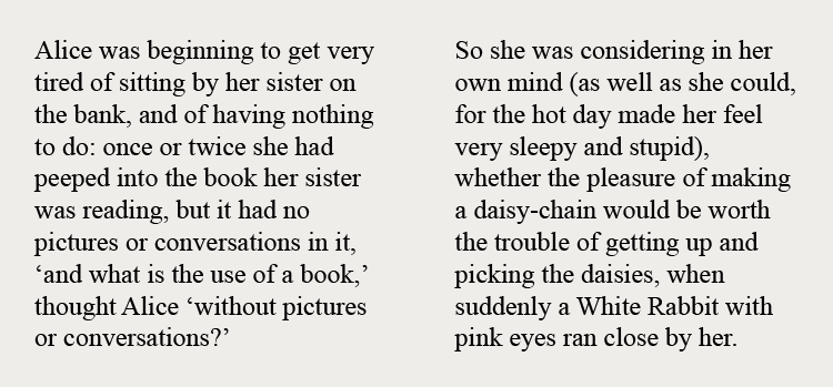
A screen reader, on the other hand, doesn’t recognize the content structure as hinted by the columns because there’s nothing in the inaccessible PDF that passes that structure along. The screen reader reads the inaccessible PDF from top to bottom, left to right, across columns. The following video demonstrates the nonsensical screen reading of inaccessible PDF content.
Source: NC State IT Accessibility
This segment of the page contains a video, “Untagged PDF Being Read by a Screen Reader”.
The link to this video is:
https://www.youtube.com/watch?v=GaNwnsT4B5s
What is PDF accessibility?
A PDF document is considered accessible when people with visual, motor, and other disabilities can read, interact, understand, and navigate the document in the equivalent manner as an abled person.
The content of an accessible PDF document needs to be in a logical, or meaningful structure, and in sequential order regardless of its layout. This can be achieved by using PDF tags. These tags provide assistive technologies, such as a screen reader, an organizational hierarchy of the document that can be read and tabbed through. These tags are similar to the semantic elements in HTML such as header, paragraph, image, and link.
The foundation of PDF accessibility is the tagging of its content.
This summer, the CTL launched its first massive open online course (MOOC) dedicated to the topic of inclusive teaching in higher education. The MOOC, titled Inclusive Teaching: Supporting All Students in the College Classroom, is a self-paced course on edX, and is open to everyone. Accessibility was an extensive consideration for this MOOC, from its main video production to the development of its supplementary materials.
Challenge: Interactive Identity Wheel Activity
One of the materials is the Identity Wheel Activity worksheet. The exercise encourages learners to identify and reflect on the different facets of their identities, and on how their identities are experienced differently in different contexts. The insight from this activity may help foster awareness on how these identities inform the way they understand the world, how they interact with it, and help them understand the idea of positionality.
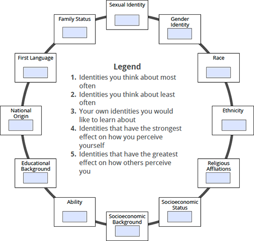
Each box on the wheel represents a different facet of identity. The learner types in the textboxes the number that corresponds with each reflective prompt in the center of the circle as it relates to a particular identity facet. An interactive PDF seemed like a good fit for the Identity Wheel worksheet because the learner can work on the activity on- or offline, save it or print it for future reference. The worksheet just needed to be made accessible; the exercise didn’t look so complex.
Solution: first UX, then UX, then tools, then more UX
The goal of the Identity Wheel exercise is to get learners to associate the reflective prompts to the twelve identity facets. The initial visual layout and experience for the exercise is as follows:
- The worksheet instructions and attribution precede the Identity Wheel. A learner would read the instructions before working on the exercise.
- The twelve identity facets are arranged in a circle. While a sighted user would commonly read the wheel clockwise, the hierarchy or order of these facets is irrelevant.
- The reflective prompts are also placed in the center of the circle for easy reference.
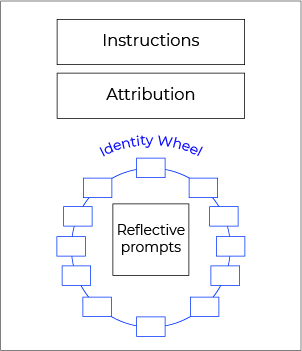
Initial visual layout for the Identity Wheel exercise
The experience through a screen reader, however, is linear, and the content of the Identity Wheel PDF needed to be in a logical or meaningful structure, and in sequential order regardless of its layout. I also had to take into account how the screen reader reads a PDF, and find solutions to its limitations. VoiceOver, for example, reads only the PDF content that is visible on screen. If half of the Wheel is visible on the monitor, then VoiceOver reads only half of the identity facets and reflective prompts.
Determining the accessible experience for the Identity Wheel worksheet was an examination of the learning process of the exercise for all learners. What guidance and information did the learners require beforehand to begin the exercise on their own? What did they need while working on the activity? Would pagination be a problem if the worksheet was split into two pages? What would the linear layout of experience be like?
We decided on the following experience structure and sequence:
- The instructions and reflective prompts would be ahead of the Identity Wheel as guidance, on the first page.
- The attribution would follow as reference, also on the first page.
- The Identity Wheel would be on the second page for readability. The tabbing and reading order of the identity facets would be clockwise.
- A duplicate of the reflective prompts remained in the center of the circle for sighted users, but would be read before the identity facets.
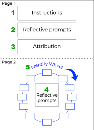
Revised visual layout for the Identity Wheel exercise.The numbers indicate the reading order by a screen reader as described above.
1, 2, 3: Design, optimize, and test
1. Design: Adobe InDesign
PDF accessibility begins from the original source, and since the worksheet has a particular visual layout, I used Adobe InDesign to create the source document. I designed the worksheet according to the accessibility experience structure and order previously described. The key to the correct reading and tabbing order in Adobe InDesign is the Articles Panel, and Tag Panel for structure—headings, paragraphs, images. I made sure that the source document had no typos or errors, and that it complied to the accessibility experience before exporting to an interactive PDF to minimize repairs in subsequent steps.
I find the following tutorials helpful in creating the InDesign interactive source document:
- Creating a more accessible PDF in Adobe InDesign
- Adobe InDesign accessibility
- Create an interactive PDF
- Articles panel in InDesign
2. Optimize: Adobe Acrobat Pro
The next step was to optimize the interactive PDF worksheet for better accessibility using Adobe Acrobat Pro. Tagging and Reading Order tools are the building blocks of accessible PDF documents to ensure correct readings by screen readers and Adobe PDF Reader’s Read Out Loud functionality.
First, I examined the Identity Wheel worksheet using the Reading Order tool. Since I structured my original InDesign document properly, the order of content needed little fixing. I had to address some peculiarities unique to InDesign PDF export (fractured paragraphs, for example), but other changes were minor.
Next, I repaired some structural tags; for example, improper headings, and list items in the worksheet instructions, with the Tagging tool. Finally, to address the issue with partial reading of on-screen visible content, I set the the page layout to “Single Page” in the “Initial View” document property.
These resources helped me understand Acrobat Pro better for accessible PDF optimization:
- Reading Order and Tagging tool in Acrobat Pro
- Add Tags to an Untagged Document
- Examine and Repair the Tag Order
- Examine and Repair the Tag Order—advanced
3. Test: Acrobat Pro, Screen reader, Adobe Read Out Loud
Adobe Acrobat Pro comes with an accessibility checker that provides a report on the level of compliance in a PDF document. I ran the Identity Wheel worksheet through the checker after fixing the content reader order and tags.
Finally, I tested the worksheet with VoiceOver—the screen reader by Apple—and with Acrobat Reader’s Read Out Loud functionality, to make sure that the reading and tabbing order was correct, and the accessibility experience followed what we had planned.
Final result: Accessible interactive Identity Wheel Activity PDF
Lessons learned
What I’ve learned from this whole process are:
- Accessibility experience is user experience and is learning experience. Get these right first, and the content will be accessible.
- Content needs to be semantically structured and sequentially ordered as much as possible before exporting to PDF to minimize repairs in Acrobat Pro.
- Having said that, you can always repair the order in Acrobat Pro.
- Tagging PDF document content is important for accessibility.
- Visual layout and meaningful structure/order for screen readers are independent of each other. You can lay out the document design any way you want, and with PDF tags, you can achieve a different reading order.
Printed from: https://compiled.ctl.columbia.edu/articles/accessible-pdf-wheel/

