“Accessibility is like a blueberry muffin—you can’t push the berries in there afterward.”
— @jina quoting @CordeliaDillon at the Smashing Conference.
This summer, we migrated two of our Dental School projects, MATCH and PASS, from the CTL’s content management tool Pagetree—a Django-based platform—to the Hugo framework. This move was done to provide a sustainable structure for the projects, and to make them open and linkable from multiple training environments to attract a broader audience.
With openness and sustainability come interesting challenges such as responsiveness and improving the sites’ accessibility. We have committed ourselves to good faith effort in striving for comparable compliance to Section 508 Accessibility Program, and in making sure that both sites perform well on all devices including assistive technologies.
Both MATCH and PASS have the same code base, architecture, and user interface. This is what Pagetree-MATCH (and Pagetree-PASS) looks like:
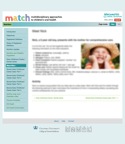
The UI is relatively straightforward. Each content page has a standard banner
and footer, a chapter navigation on the left (sidenav), and a main content
body that occupies the bulk of the page on the right side. Below is a
simplified wireframe to encapsulate the layout.
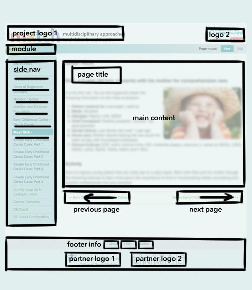
Pagetree-MATCH and its source code are neither responsive nor accessibility-compliant. Screen readers, such as VoiceOver, follows the elements on a page linearly in the order that they appear in the corresponding source code. The elements Pagetree-MATCH are coded in the source as follows:
<project logo 1>
<logo 2>
<module title>
<sidenav>
<page title>
<main content>
<previous page>
<next page>
<footerinfo>
<partner logo 1>
<partner logo 2>
The sidenav appears before the main content because it is a simple div
that floats to the left. The source code produces the UI above and the form
matches the visual function. Users can browse around the site with little
obstruction.
However, VoiceOver reads the site in a linear flow as indicated by the red path:
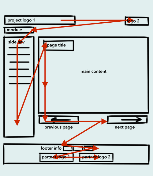
This flow is not an efficient outcome for a screen reader. The user will have
to listen through the banner elements (project logo 1, logo 2, module title) and every item on the sidenav before reaching the main content.
So, we have to evaluate what the roles of each element are for the users, and
we have to look at the page from the screen reader’s perspective. The most
important portion on the page is content, which consists of the page title
and main content. The previous-next navigation is also necessary for the
users to connect sequentially to the chapters of the module. The banner
elements on the top of the page (logos, module title) are useful for branding
and identification. The sidenav that links to the chapters in the module,
while convenient for navigation, is auxiliary.
The elements of the page must be deconstructed and rearranged linearly as
“heard” by the screen reader. The ideal flow path for the page should be a
short trip through the banner elements, to the page title and main content.
The complementary sidenav can appear later in the structure. To further help
the users get to the main content quickly, a skip to content (or skip) link
is placed at the top of the page. It is interesting to note that this
arrangement accommodates the layout design for smartphones as well.
The new page structure in the source code for Hugo-MATCH is now the following:
<skip to content>
<project logo 1>
<logo 2>
<module title>
<page title>
<main content>
<previous page>
<next page>
<sidenav>
<footerinfo>
<partner logo 1>
<partner logo 2>
Here is the corresponding linear wireframe:
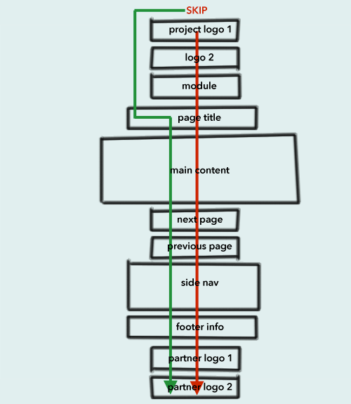
A screen reader will read the page along the red path. If the user triggers the
skip navigation, the screen reader will follow the green path.
The reordering of the page elements is not the only update we introduced to improve accessibility. Proper headings, ARIA (Accessible Rich Internet Applications) landmarks and roles are used extensively to identify these elements semantically (for instance, navigation, main content, complementary content, and footer).
And finally, these elements, with the new structure intact, are placed back in the original UI design using new CSS definitions and Bootstrap framework for responsiveness. This is the wireframe of the interface with the aforementioned screen reader paths.
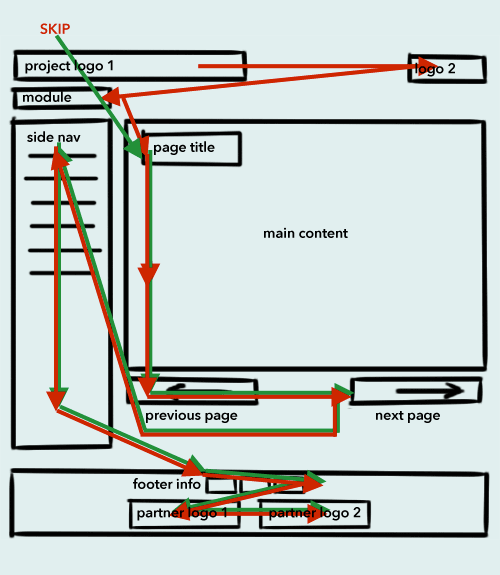
While the Hugo- and Pagetree-MATCH wireframes “look” the same, the source codes are quite different as the result of the overhaul to make the pages responsive and more accessible.
Printed from: https://compiled.ctl.columbia.edu/articles/deconstructing-accessibility/

