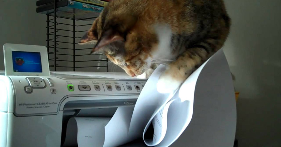
“Can you teach us how to make sites print right?” a colleague once asked me. The reason websites are not printing right is probably because not much attention is given to what the sites should look like on paper.
Printing has NOT fallen out of favor, regardless of how much we’ve accepted and appreciated digital content. The printed page is still cheap, portable, and convenient. Because print is very much ingrained in the culture of content consumption, we need to include it in our web development process.
In this post, I offer some guidance, based on my experience, because indeed printing from web to paper is not as straightforward as one might assume.
Print is a device
The printed paper is a portable, static reading device. It is a component of adaptive design alongside desktop and mobile devices, and assistive technology for accessibility. Because of this, it should be given ample consideration in the web development process.
What you see on the screen is not necessarily what you’ll get when you print because the printed version is not a facsimile of the webpage. The browser renders HTML, applies CSS for print mode, and then transfers everything to the printer, and onto the output: physical, fixed size pages of paper. Unless specified exclusively for screen use, all defined general CSS rules, even those for responsive CSS, are applied on the printed output. Therefore, you might see some unintended display on paper if the rule in the general CSS is not filtered out. The print stylesheet rules are needed to accommodate the differences between screen and print.

The objective is to design and develop well for print, not to recreate a screenshot of a webpage.
Print should be part of the process
Printing is like a pizza with toppings—you can’t simply put pepperoni, or vegetables, whichever toppings of your choice on the pizza after it’s done baking. The toppings need to be one with the cheese and sauce, in harmony.
Similar to mobile and accessibility design, print cannot be attached to the web development process as an afterthought, or eliminated as a result of time constraints. Because of its static nature, there is a complementary UA and UI for the printed version. For example, delivery of multimedia and interactive content is completely lost in print. Thus, alternative options have to be offered; otherwise, critical content may be missing or distorted.
I recommend a thoughtful design for print as a corresponding piece for the screen display. It’s also a good practice to prepare and test the layout, architecture, and “behavior” of the webpage elements as you’re designing for digital devices.
Decide what is fit to print
You can’t print the active and dynamic nature of the internet: there is no multimedia, no hyperlink, no navigational tools, and no interactivity on paper. Cues such as “click here” or “view the clip” are meaningless when printed.
In the web development process, consider what the users of your website will take with them when they print. The following are a few things to be aware of:
Readability:
For the printed pages, the conditions on how the text is read are different. Black text on white background provides the maximum contrast suitable for paper, especially if a user decides to print in black and white. Light text on dark background should be avoided.
Keep in mind that there is no way for a user to change the font size on paper, so, make sure the text for print is large enough to be readable.
Branding:
Print resolution is not the same as that on screen, and while banners, photo carousels, and other dynamic branding visuals are aesthetically pleasing on the web, they will not translate well on paper. For example, you may want the logo of your site to assume a different location or prominence on paper, or use an image that prints well. You can define the rules in the print stylesheet, for example:
HTML…
<div class="logo">
    <img class="screen-version" src="logo-screen.jpg" />
    <img class="print-version" src="logo-print.jpg" />
</div>
CSS…
/* General CSS */

.screen-version {
    display: inline;
}
.print-version {
    display: none;
}

@media print {
    .screen-version {
        display: none;
    }
    .print-version {
        display: inline;
    }
}
Navigation:
Site navigation, breadcrumbs, and click prompts are irrelevant on paper, and there is no need to print them out. Design them in modular fashion so they can be eliminated from the print version without breaking the overall layout of the page. This post, for example, has a print stylesheet that removes the screen-specific elements when you print this page.
Hypertext links:
URLs of linked text should be expanded on the print version of the webpage, and
this can be done in the print stylesheet with ::after pseudo-element. The
following image shows the hypertext linking “Visit-the-site” and “Infosheet” to
other pages.
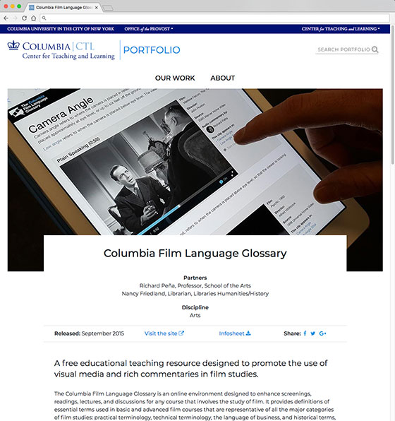
Screen version showing linked text
The HTML code for one of the links…
<div>
    <a href="https://filmglossary.ccnmtl.columbia.edu" target="_blank">
        Visit the site
        <i class="fas fa-external-link-alt" aria-hidden="true"></i>
    </a>
</div>
The print CSS…
@media print {
    a::after {
        content:": " attr(href) " ";
        white-space: pre;
    }
    .fa {
        display: none;
    }
}
And the printed result of the webpage, with URLs expanded:

Print version, with URLs expanded
Multimedia:
Multimedia content, while very engaging on screen, is meaningless on paper because what the printed page will show is just a poster or an image of the player. You can provide an alternative text and a URL for the media so that your website users can refer to it in the future.
For example, let’s look at the following video embed:
<!-- Video embed -->
<iframe width="560" height="315"
    src="https://www.youtube.com/embed/26bVTqcuaDI"
    frameborder="0"
    allow="autoplay;
    encrypted-media"
    allowfullscreen></iframe>

<!-- Print alt text -->
<div class="print-alert">
<p>This segment of the page contains a video. The link to this video is https://www.youtube.com/embed/26bVTqcuaDI</p>
</div>
In the CSS:
.print-alert {
    display: none;
}

@media print {
    iframe {
        display: none;
    }
    .print-alert {
        display: block;
    }
}
The printed version will substitute the iframe embed with the alternative text.
Interactive content:
Interactivity is another aspect of the web that can’t be transferred to paper. Pop-up modals, for example, will not be visible on the printed form. You may need to think about the “takeaway version” of the interaction, which is akin to a transactional receipt. At the CTL, we created an interactive social mapping tool, and thoroughly designed the complementary print version.
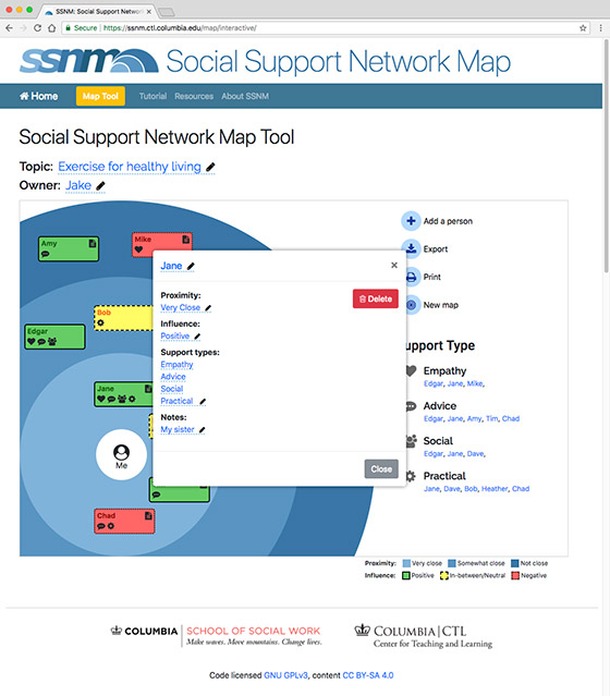
Web version of the interactive social mapping tool.
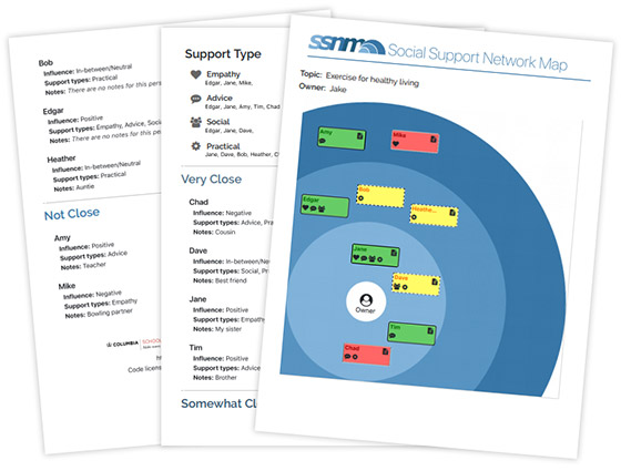
Printed copy of the interactive social mapping tool.
Other things to consider
Background color or image printing is a deliberate user choice for most print drivers. If the web content relies heavily on background colors to deliver meaning, this may present a problem if users choose to disable background printing. While there are CSS methods to force background printing, they are inconsistent across browsers and platforms.
Printed pages are not continuous, and have fixed dimensions. At times the printed version will cut off images, or other continuous content elements if they are at the end of the pager. The page-break-after, page-break-before, and page-break-inside can be used to define how these content elements behave when printed.
And finally, the users of your website may choose to print in black and white. So, be sure to test if all your content elements, especially text, have enough contrast on paper to be acceptably readable.
In short…
Print is a standalone static reading device, and there’s quite a bit to consider when you’re preparing your web content for print. However, if print is folded into the web development process along with its adaptive design siblings from start to finish (and let me stress how important this is), you may be able to cover most of your website’s users’ needs quite satisfactorily.
Printed from: https://compiled.ctl.columbia.edu/articles/print-is-device/

