Software development in educational technologies benefits greatly from user experience design (UXD) to ensure that the user experience leads to the outcome of the pedagogical goals behind the application design.
Color choices in user interface design are an important component of UXD. They can be a source of harmony that integrates product identity, visual design, mood. A combination of tone and saturation in user interface design can increase usability, affect functionality, and shape behavior. Colors can also indicate interactive components, and express relationships between elements on a page. A good selection of colors can improve user engagement with the product.
Color psychology shows us how color can influence our mind and elicit reactions. So, why not use a splash of chroma in our designs of educational software? I’ve been thinking about colors a great deal in my UX and visual design work in Locus Tempus, a recent web-based application that we developed here at the CTL.
Logo colors

Locus Tempus (main website, information) is an open-source digital mapping tool that leverages a geospatial environment to engage students as repository builders, researchers and curators. Faculty and students from all disciplines can collaboratively identify, organize, and visualize geolocated materials within a course context.
I thought it was appropriate to set the tone of Locus Tempus with the color palette in Mapbox—the mapping tool used in Locus Tempus— and other mapping applications such as Google Maps, and Apple Maps. These applications have these color palettes in common: blue, amber (or yellow), and green. I chose these colors to represent the identity of Locus Tempus in its logo.
However, this choice of colors didn’t begin and end in the logo. To reflect the Locus Tempus brand throughout the application, I needed to make sure that these colors are in harmony outside their use in maps, and examine how they can be used to improve user experience and bolster usability of the tool.
Grayscale matter
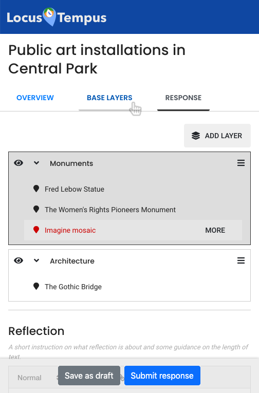
At first, I wanted us to focus on the user experience for the tool, so the interface was mostly grayscale. When only colors are used as visual cues to convey meaning and guide user behavior, these cues will not be accessible to users who are blind or have limited color vision. By leaving the Locus Tempus user interface in grayscale for the most part of the design and development phase, we can shape an accessible user interface without color cues.
After we decided on the components, layout, grouping, architecture, and functionalities, and made sure the experience is accessible, then I began the process of choosing the right color palette.

Colors for user interface
Looking at the palettes in the aforementioned mapping applications, blue is used to represent bodies of water, a dominant component on the map. Amber or yellow indicates major roadways such as freeways and highways. In Google Maps, areas shaded in light yellow suggest places of interest. And finally, green visualizes vegetation.
Taking the roles of these colors and their visual representation in maps, combining the psychological influences these colors can evoke, I reached a more abstract understanding of the palettes, and how they can also represent function. Blue is the dominant representation, is generally favored, and it suggests reliability. Amber (and yellow) is warm and playful, and it attracts attention. Aligning with the metaphors used in maps, amber represents a way of getting somewhere, and building blocks of interest. Finally, green is the color of growth, and a “go” signal.
And so, here are the colors I used for Locus Tempus user interface:
Primary: Blue
- Blue is calming, generally a favorite color to suggest dependability.
- It is also the color of Columbia University.
- Blue is used in Locus Tempus as the main color for the application, the primary level pages and hierarchy.
Secondary: Amber
- Amber is warm, inviting, playful, and it focuses attention.
- In maps, it represents a way of getting somewhere, and building blocks of interest. In Locus Tempus, amber is used to group parts and actions that lead to the completion of an activity or action.
Accent: Green
- Green represents growth and positivity.
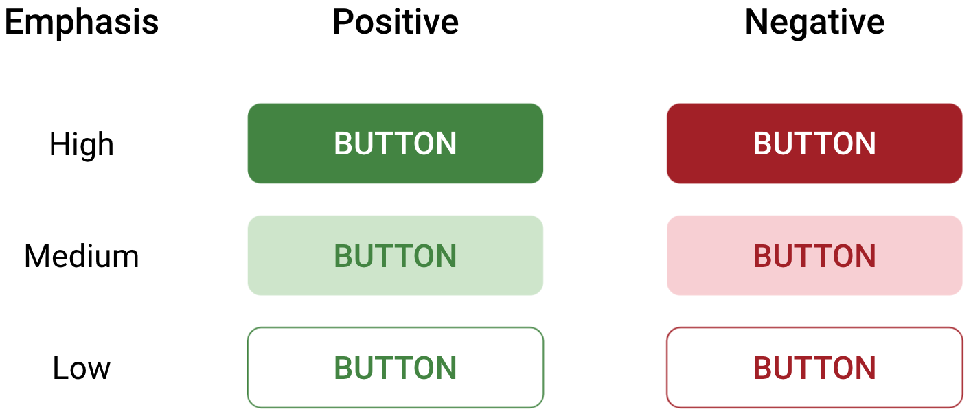
- It is a “go” signal, used on call-to-action (CTA) components, such as buttons, that adds value or content to an activity or action.
Additional: Red (and pink)
- Red is complementary to green.
- It implies risk and danger. In Locus Tempus it serves to alert users of an error, or of an irreversible action such as deletion.
- Red is also used for the markers and highlights because it stands out on the map. This may seem contradictory to the previous points, However, the usage for this purpose is minimal and localized, so I don’t think there will be a huge confusion. I may revisit this in the future.
The color scheme for Locus Tempus is tetradic: square and rectangle.
Finally, I applied these colors to the user interface, and the following shows the color palette and their context on the tool’s interface.
And here is a comparison of the interface before and after the colors were put in place.
Colors for hierarchy and emphasis
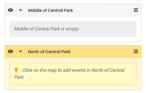
Colors can also indicate interactive components, and express relationships between elements on a page. The different variations of amber, for example, is used on the Locus Tempus interface to signal that a layer is active and new map markers can be added to it.

Hue, saturation, and brightness of colors can be used to signal level of prominence and hierarchical relationship of components. Dark green buttons in Locus Tempus have higher emphasis than their lighter counterparts, and they represent more important actions. Saturated red buttons suggest actions that need to be approached with caution.

Wrapping it all up
Locus Tempus has a complex user experience, and color plays a major role in its design. I used the colors commonly used in maps to represent Locus Tempus’s identity, in its logo and consistently throughout the application. Colors in Locus Tempus are applied intentionally to communicate meaning in interface components, improve usability, and shape user experience. The harmony in the color palette integrates functionality and aesthetic design, and I hope it helps evoke delight and consequently improve user engagement with the application.
But it is important to note that when only colors are used as visual cues to convey meaning and guide user behavior, these cues will not be accessible to users who are colorblind or blind. Information about these visual cues must also be conveyed through additional ways.
Printed from: https://compiled.ctl.columbia.edu/articles/ux-colors/

